Nothing is for sale here. Freewill tips keep the site running. Want to help? → Tip via Paypal
Animated Tooltip | Fade In
This tooltip can be used on plain text, links, and images—and probably other stuff I didn't test it on! On plain text you'd want to use some kind of CSS styling to your site visitors could see the difference between the tooltip word or phrase and the rest of the text. Check out the example below:Rest your cursor on the underlinedshaZam! word.
That's how it looks on a link (link is null for this tutorial). You can remove the underline, or change the way it looks, in the CSS code. You can also change the background image or remove it. Instructions are in the CSS code and there are different background images at the end of this tutorial.
This time rest your cursor on the This is another tooltip. Its name is Fred. Say hi to Fred, he likes having his presence acknowledged. underlined phrase.
 You could use the tooltip to describe something about the image: location, names, dates, activity, whatever.
I have one more thing to show you before we get into the code. Rest your cursor on the word "bonus" below to see it.
Are you curious what the
You can use HTML and CSS styles to add color and other stylings to the tooltip message. You can even add images!  bonus could be?
Pretty versatile tooltip, eh? Let's take a look at the CSS.
Tooltip CSS Code
.tooltip-fade {
  border-bottom: 2px dotted seagreen; /* remove this line to remove the underline */
  position: relative;
  display: inline-block;
}

.tooltip-fade-text {
  visibility: hidden;
  width: 200px; /* change the width of the tooltip here */
  background-color: #000; /* background color without an image */
  background-image: url('images/tooltip-bg.jpg'); /* change/remove background image here */
  background-size: contain; /* allows the browser to adjust the background size to fill */
  border: 1px solid black; /* border around the tooltip */
  color: #fff; /* text color */
  font-size: 1.1vw; /* text ize */
  text-align: center;
  border-radius: 6px;
  padding: 7px 12px; /* change the padding inside the tooltip */
  position: absolute;
  z-index: 1;
  bottom: 125%;
  left: 50%;
  transform: translateX(-50%);
  opacity: 0;
  transition: opacity 1.1s; /* change the speed of the fade-in animation */
}

.tooltip-fade-text::before {
  content: "";
  position: absolute;
  top: 100%;
  left: 50%;
  transform: translateX(-50%);
  border-width: 8px;
  border-style: solid;
  border-color: #000 transparent transparent transparent;
}

.tooltip-fade:hover .tooltip-fade-text {
  visibility: visible;
  opacity: 1;
}
I recommend placing that in an external style sheet rather than on the page. If you don't know how to do that, I have a tutorial on the types of styles sheets and how to use them at the other end of that link.
I've made comments in the CSS code where you might want to make changes so I won't elaborate much about it here. The lines without comments you'll probably want to leave alone unless you have a lot of experience with CSS, unless you just want to experiment on a practice page. That's how I figure this stuff out—practice pages.
I'll just make two quick comment regarding the code: first, if you change the border color in line 13, you might want to change it in line 36 as well, so they match. Otherwise you could leave it as is or remove the border in line 13 but leave line 36 alone. Line 36 is the color of the little pointer at the bottom.
Second, if you use a background image you'll need to include the correct path to the image and the actual name of the background image you use in line 11 or you'll only see the background color.
Now you need to know how to code the HTML. I've included the code for all four examples in the code box below, along with explanatory notes. If you click the copy button you'll get all the code and notes to paste into your own file.
Tooltip HTML Code
<!-- LINK TOOLTIP  -->
<!-- add the 'tooltip-fade' class the 'a' tag,
     add the 'tooltip-fade-text' to a span tag after the link text  -->
<a href="http://www.boogiejack.com"
class="tooltip-fade">Boogie Jack<span
class="tooltip-fade-text">Visit BoogieJack.com.</span></a>

<!-- PLAIN TEXT TOOLTIP -->
<!-- nested span tags, the active text follows the actual tooltip text,
     note that the 'tooltip-fade' class doesn't have to be in a span tag -->
This time rest your cursor on the
<span class="tooltip-fade">
<span class="tooltip-fade-text">Tooltip text goes here</span>
underlined phrase goes here</span>.

<!-- IMAGE TOOLTIP -->
<!-- note the 'border: none' in the first line was used that to remove the
     underline, you could also remove it from the css styles if you prefer
     you could add the underline with inline css if you prefer that,
     you could put the tooltip text in the alt tag for the visually impaired -->
<div class="tooltip-fade" style="float: right; border: none;">
<img src="images/pic.jpg" style="margin: -20px 0 0 20px; max-width: 170px;"
alt="image description"><span class="tooltip-fade-text">Tooltip text here.</span></div>

<!-- STYLIZED TOOLTIP -->
<!-- triple nested span tags, be sure to close them all if you do this,
     the third span tag is to add CSS styles to the tooltip, you won't
     need it if you only add HTML elements like bold and italic tags -->
Are you curious what the
<span class="tooltip-fade">
<span class="tooltip-fade-text">You can use <b>HTML</b> and <i>CSS styles</i> to add
<span style="color: lime; font-size: 1.3vw; text-decoration: underline">color</span>
and other stylings to the tooltip message. You can even add images!
<img src="images/grin.png" style="width: 22px; height: 22px;"></span>
bonus</span> could be?
The explanations are included in the HTML code so I won't elaborate. I'll just add that if you use this with an image you need to include the correct path to the image and the actual image name that you use. You probably knew that already, but Grunhilda didn't.

Background Images
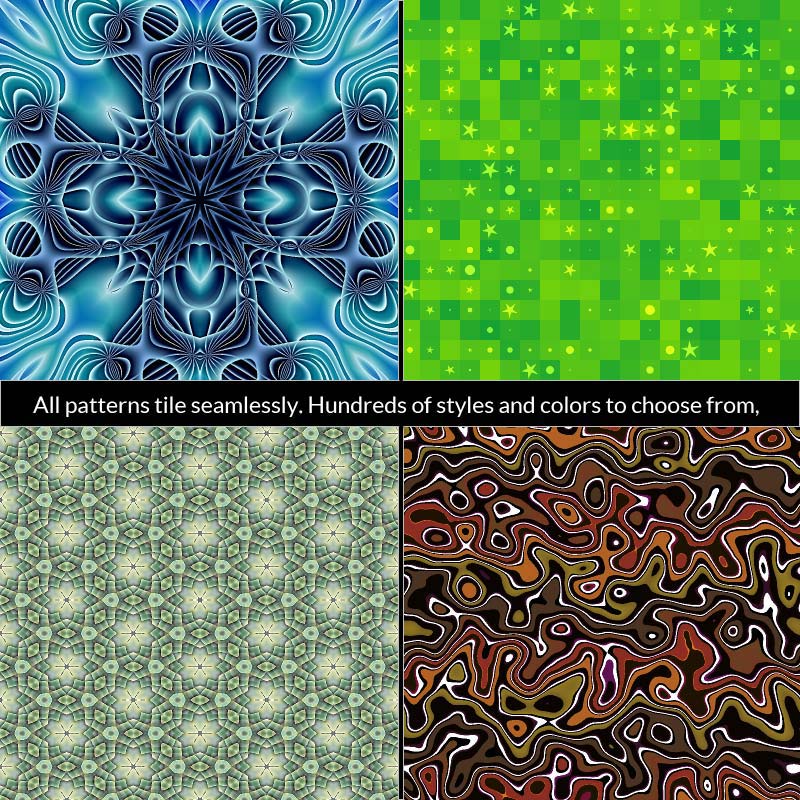
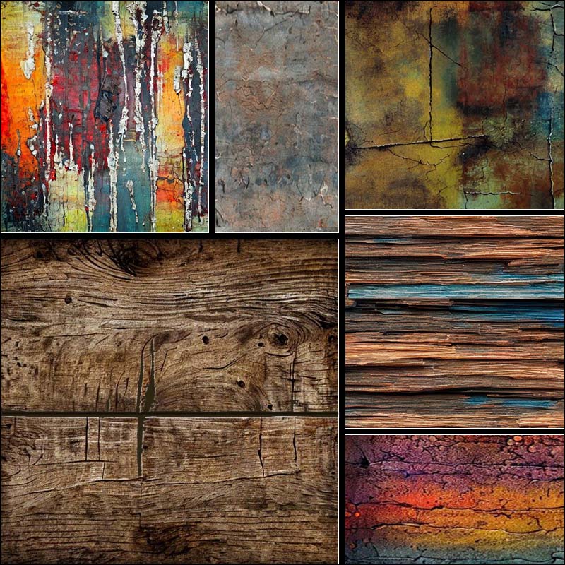
And here are the background images I promised. Download as many as you like.For light colored text...


For dark colored text...


