Nothing is for sale here. Freewill tips keep the site running. Want to help? → Tip via Paypal
Button Sprites
A sprite is a single image that contains multiple images. When a sprite is positioned correctly you will only see one of the images on a sprite at a time. An event, such as placing your mouse on the image or clicking the image will change which part of the sprite is displayed.
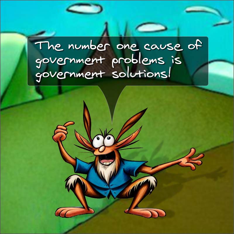
To the left is an example. Place your cursor on one of the buttons to see the image change of state. Click a button (the link is null) to see another change of state.
The effect is similar to the old JavaScript rollover buttons, but because it’s all one image, there’s never any lag time. It’s a cool effect, but there’s more…
Using sprites also helps your web pages download faster if ou use image button links. You see, file size isn’t the only factor that determines how quickly a page load. If we use a separate image for each button state, each image is a separate http request. The more http requests there are, the longer it takes the web page to load.
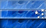 Even better, the text on the buttons is placed there with HTML and CSS. So the same image is used for each button. You can see the full sprite to the right. This image was used for every button in the above example.
If you had 10 buttons in your navigation, and a separate button for each state, that’s 30 http requests for your navigation system. With sprites, it’s ONE http request—and that will download around 30 or more times faster, depending on how well each image is optimized!
And … it also looks pretty cool to have the image change for the different link states. Looking good is part of the game.
Of course, button navigation isn’t for every site, but sprites can be used in other ways. Sites like Amazon.com and Google use sprites. I'd guess you can think of at least one other use within a few minutes. You're smart like that, I betcha!
How It Works
The HTML
<div style="float: left; width: 160px; margin-right: 20px; margin-bottom: 10px;">
<a class="sprite" href="#null"><span class="shim">Products</span></a>
<a class="sprite" href="#null"><span class="shim">Services</span></a>
<a class="sprite" href="#null"><span class="shim">Specials</span></a>
<a class="sprite" href="#null"><span class="shim">Affiliates</span></a>
</div>
Add as many links as you need, changing only the link destination and link text. The buttons will automatically display for each new link you add.
NOTE | The link must include class="sprite" and the link text should be surrounded with a span tag using the class="shim" property and value. |
.sprite
  {width: 150px;
  height: 30px;
  text-align: center;
  text-decoration: none;
  display: block;
  background-image: url(images/sprite-37.jpg);
  background-position: 0 0;}

.sprite:hover
  {background-position: 0 -30px;}
.sprite:active
  {background-position: 0 -60px;}

.shim
  {color: #fff;
  font-weight: bold;
  position: relative; top: 6px;}
By creating a CSS class and using the CSS background-position property, and then coding a different position for the background image for each link state (normal, hover, active) it looks like different images are loading, when in reality we are just viewing different areas of one image.
Ideally, you’d add that to your external style sheet, but you could also embed it in the HEAD section of your page. See the style sheet tutorial for more info about inline, embedded, and external style sheets.
Relax. It probably looks harder than it really is.

| Lines | Description |
|---|---|
| Lines 1-8 | Determine how the sprite will be displayed when the page loads. The first line establishes a CSS class named “sprite” …tricky, huh? |
| Lines 2-3 | Sets the width and height of "display window" for the sprite. In other words, it says which part of the image will be shown when the page loads. |
| Line 4 | Centers the link text horizontally on the button. |
| Line 5 | Removes the underline from the link text. |
| Line 6 | Forces each new button to start on a new line. This basically stacks the buttons one on another as you see in my example. Because of this, no paragraph or break tags are needed in between buttons unless you want extra space between them. |
| Line 7 | This is where you set the background image – in this case, it’s the sprite. |
| Line 8 | This means the background image positioning will begin from the 0x0 point, in other words, from the upper left hand corner of the sprite image. |
| Lines 10-13 | Sets the background image's display position for the hover and active link states. Since the sprite is built vertically, the start point is always 0 (zero pixels from the left). Each button of my sprite is 30 pixels high with the hover state in the middle, so the background position for the hover state starts at -30 pixels, which is the same as saying 30 pixels from the top. |
| Lines 15-18 | This is where the color and font-weight values for the link text are set. Without the positioning the link text would line up at the top of the button. So, we set the positioning to center it vertically. You’ll need to adjust that up or down depending on the sprite you use and the font size. |
You might be wondering why I didn’t set the vertical centering in the opening sprite class along with the horizontal centering. The answer is, because it doesn’t work! Using the position property there affects the position of the whole button rather than just the link text. To overcome that, we place the link text inside a span tag with the properties we want.
If you use a sprite you make instead of one of our button sprites, you’ll have to adjust the numbers to your own image.
That’s the way the sprite fizzes without carbonation!