Nothing is for sale here. Freewill tips keep the site running. Want to help? → Tip via Paypal
Five Must-Know CSS Tips
Below are 5 “must know” CSS tips. Two are about avoiding unwanted results and three are practical, how-to knowledge. All will help you get better results from your coding experience.Avoid Unwanted Results
A lot of folks find things go awry when they use the CSS padding property in situations where precise measurements are crucial. The problem often is that they don’t account for the padding in their measurements. Padding is added to the width of an element. So this:
width: 500px;
padding: 22px;
}
…means the division will be 544 pixels wide unless something else is constraining it. If it must be 500 pixels to fit your design, the padding could blow it up. To have a division 500 pixels wide with 22 pixels of padding we have to subtract the padding:
width: 456px;
padding: 22px;
}
Do you understand why we subtracted 44 pixels from the width of the division instead of the 22 pixels of padding we want? It’s because there are 22 pixels of padding on both sides, for a total of 44 pixels. That little "oops" blows up a lot of designs too—but not yours!
In the “old days” of the Internet, people use to cram keywords into their pages to try and get better rankings, but would hide them from viewers by making the text the same color as the background. The search engines caught onto that and started penalizing sites for it.
With the advancement of CSS, some folks are doing basically the same thing, only they’re moving the text off the page by using negative margins or setting the display property to none.
Don’t do that! The search engines know about it. Search engine raters are trained to look for that and use a browser plugin to disable CSS. All they have to do is click a button and all your hidden text is revealed.
The first time a rater views your page and the hidden text is revealed . . . BOOM! The site is busted and penalized.
I can hear the arguments. But, but, they can't check all the sites. What are my chances of getting caught?
Well, probably pretty good. Don't think they haven't developed automated methods to flag sites for the reviewers to check. And if your site is in a competitive niche, don't think a competitor won't try to find something to report.
Practical Knowledge
When we position an element using an absolute position, it’s there. The trouble is, while having that element precisely where we want, many times “precisely where we want it” is relative to the current content.
Suppose we update the page later and add three paragraphs of text at the top. All the content is moved down the page, but the absolutely positioned element stays in the same place. With the text that surrounds the element changed, it may no longer be positioned where you want.
Furthermore, suppose you want to position something way down the page. It can take a lot of guessing and correcting to get it where you want.
There is an easy fix to both of these problems, just place the element that’s absolutely positioned inside a relative positioned element.
top: 20px; left: 222px;">
<img src="images/donkey.png"
style="position: absolute;
top: 10px; left: 20px;"> </div>
Now the donkey image in that code example will move down the page with the relatively positioned division, keeping the image with the text it applies to.
You can assign more than one class to an HTML element. This can be useful for minimizing code.
Suppose you really, really, really wanted to emphasize a certain word like I just did witht he third really. You can code it all into an inline style:
Or, you could create a class for each of those styles in your remote style sheet and achieve the same result with this:
Put all the classes into the same class declaration and seperate them with a space. Easy, fast, time-saving, repeatable, and low in saturated fat!
NOTE: This tip doesn't apply to small screens viewing a responsive layout. The browsers shifts responsive content around to fit the viewport.
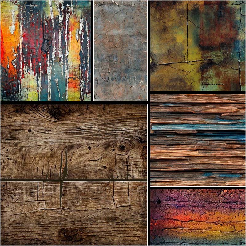
 When we float an element the surrounding text will flow around it, like it’s doing here with the text flowing around the image of rusty metal plate. If the text passage is long enough it will then flow under the element once it gets beyond the end of the floated element.
You can see how the text in this paragraph has cleared the floated image and flows under the image now. That’s often what we want to do, but there are also times when we don’t want the text to flow under the element. That’s where the overflow property comes in handy.
…the text has now gone back to the normal page margin. Note that I used images because it was an easy-to-do example, but this works with other elements. You will need to set the width of the floated element for it to work with any element that has a 100% width by default, such as paragraphs or divisions.
Here’s the inline code for that division:
Content here... </div>
This technique could be very useful any time you want to display an image and provide descriptions while keeping things more neat and professional looking.
It could also be useful for something as simple as a family picture gallery that includes descriptions for your family and friends. If the text doesn't go past the bottom of the picture you'll need to clear the float or the next image could be beside the first instead of under it. Here's a CSS float tutorial if you need it.
This tutorial is over, but here are some pictures using this technique just for fun.
Just for Fun


<img src="images/image-name.jpg"
style="float: left;
max-width: 320px;  /* "max" is for responsive sites */
max-height: 213px; /* use normal width and height if your site is not responsive */
margin-right: 20px;"
alt="demo">
<div style="overflow: hidden;
font-size: 1.3vw;
border-top: 1px solid orange;
padding-top: 9px;">
Text that flows beside the image goes here.
<p>
Add paragraphs as needed.
</p>
</div>
<br style="clear: left;">