Nothing is for sale here. Freewill tips keep the site running. Want to help? → Tip via Paypal
CSS Image Borders
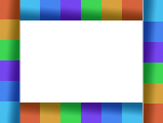
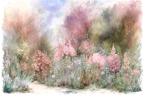
Using CSS we can now use images for borders around HTML elements. You can see an example below with the photo of my boss closely monitoring me.

The jagged purplish edge around that picture is not part of the picture, but rather, it's added to the picture using CSS. If you don't see it, sorry, but your browser either desperately needs updated or it's not a prime-time player.
In this tutorial you'll see several examples, and at the end you'll be able to download the images I made and used here that you can use for your own borders. The images were designed specifically for this purpose, but you can use any images. It's fun to play around.
In these examples, the CSS I show you will be the code you'd use in an external style sheet.
You could use inline or embedded CSS as well. The browser doesn't care, but using external style sheets keeps your source code cleaner, plus it's just easier to make changes and to maintain. If you don't know about these styles, you'll find these introduction to css and style sheets tutorials helpful.
Using an external style sheet, the HTML is very simple:
class="border1"
alt="my boss">
The class="border1" in the second line is what activates the CSS for the image border. All the styles are in the external CSS styles, including the width and height. If you're going to use the same image border on different sized images you could add the width and height to the image tag instead.
Here’s the CSS for that example:
img.border1 {
float: left;
margin-right: 22px;
margin-bottom: 12px;
width: 100%;
max-width: 160px;
height: auto;
border: 15px solid transparent;
-moz-border-image: url('images/border1.png') 28 repeat;
-webkit-border-image: url('/images/border1.png') 28 repeat;
-o-border-image: url('images/border1.png') 28 repeat;
border-image: url('images/border1.png') 28 repeat;}
Line 1 attaches a CSS class name of "border1" to an image element. The name can be anything you want as long as it begins with a letter and not a number. To used different border images for other photos you can copy and paste the CSS into the same style sheet and just change border1 to border2, and keep increasing the number for each new border style.
Line 2 floats the image to the left so text will flow around it. Change "left" to "right" if you want the image on the right side. Remove the line if you don't want text to flow alongside the image like I show in these examples.
Lines 3 and 4 adds a margin on the right side and bottom of the image so text doesn’t butt right up against it.
Line 5-7 introduces the width at 100%, the max-width is set to the actual image width, and the height is set to auto. What's that mean? It makes the image responsive so it scales down as necessary to small screen sizes.
Line 8 adds a 22 pixel border around the image, This is how wide the image border will be. Instead of using transparent for the border color value, you could instead choose a color. The image border will cover it in modern browsers, but those with older browsers will see the border color.
Lines 9-11 sets the image border for various older browsers. Be sure to change the path to the image and image name correctly for your site. The image border property has been around long enough you can probably leave those lines out if you like. Older browsers will just see the image without the image border.
Line 12 is the sets the image border for modern browsers using CSS. The first part after the CSS property is the URL and path to the image to be used as the border. After that you see: 28 repeat; …so let’s explain that part.
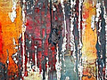
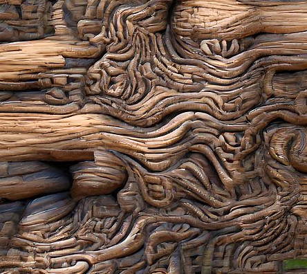
This number defines how the background image will be sliced. The values represent the inward offsets from the top, right, bottom, and left edges as shown in the image below. In the code shown, the four slices will all be equal.
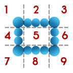 In effect, with those four lines you define, the browser divides the one border image into nine regions: four corners, four edges and a middle. The four corners maintain their exact size. The middle, the part labeled with the number 5 in the above image slice example, is discarded unless the “fill” property is included. The sides will either repeated or stretched. More on that shortly.
Note: You can use pixels or a percentage for the unit of measure. Using pixels, do not include the “px” as you do with most pixel measurements. However, if you want to use a percentage, the percent symbol (%) must be used. <sarcasm>Consistency is a wonderful thing.</sarcasm>
If I wanted the top and bottom the same, and the two sides the same but different from the top and bottom, I would code the last line like this:
Of course, those numbers can be any combination you choose. In that sample the top and bottom offsets would be at 15 pixels, and the left and right side offsets would be at 23 pixels.
Just as with a lined border, you can also set a different width for each side.
With that code, you’d have a border of 15 pixels on the top, 20 on the right side, 10 on the bottom, and 30 on the left side. I have no idea why you’d want a border like, but you always were a little bit different.

So now that you (hopefully) understand what the numbers mean, let’s look at the last bit of that code, which is “repeat.” This tells the browser what to do with the slices. Since we have to tell the browser what to do, that means we have options. These are:
repeat | round | stretch
This means the parts numbered 2, 4, 6, and 8 in the dissected background will be repeated along the sides of the image until it fills the space between the corners, similar to how a background image is tiled on a web page.
The "stretch" value stretchs the chosen section between the corners. Be aware though, that if the image has to be stretched too far it will lose quality.
The "round" value is like repeat, only the browser divides the space so it fills it in more smoothly. It essentially starts tiling the image from the center so the corners match each other. In most cases round will probably look better than repeat because it hides the "joints" better.
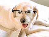
To use the CSS code created earlier, you'd simply add the class name to the image you want to use it with. Here's the HTML code for the example image:
alt="the boss of the house">
Yup, that’s our dog, the boss of the house. She likes to lay on my lap or my desk while I work. Makes it hard to type, but what can I do, she’s the boss.
So that’s how you use an image border. You can use it in any place where you would use a line border: around divisions, paragraphs, images and more.
Below are a few more examples and the CSS code used to make them. In these examples I’m only using the CSS code, not the vendor code for older browsers. You can add that in if you like. I'm also showing only the border-image line, not all the CSS code since it's all the the same as before.
After these additional examples you’ll find the background images I used for them. Feel free to download them and use them as your own image borders.
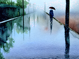
 border-image: url('images/border-1.png') 15 round;}
 ←Download
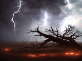
 border-image: url('images/border-2.png') 34 round;}
 ←Download
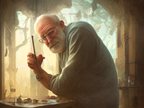
 border-image: url('images/border-3.png') 23 round;}
 ←Download
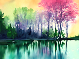
 border-image: url('images/border-4.png') 12 round;}
 ←Download
Note: See the fine white line between the picture and the border? That was done by adding 1 pixel of padding to the photo, which allows the page's background color to show through.
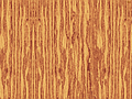
 border-image: url('images/border-5.png') 9 repeat;}
 ←Download
 border-image: url('images/border-6.png') 8 round;}
 ←Download
Note: Here I added 3 pixels of padding to the image, and added a black background color to the CSS.
border-image: url('images/border-7.png') 28 repeat;}
 ←Download
 border-image: url('images/border-8.png') 26 round;}
 ←Download
 border-image: url('images/border-9.png') 42 round;}
 ←Download
 border-image: url('images/border-10.png') 42 round;}
 ←Download
 border-image: url('images/border-11.png') 2 repeat;}
 ←Download
 border-image: url('images/border-12.png') 24 repeat;}
 ←Download
Showing these examples at such small sizes doesn't show off the technique as well as it could. Here's a larger sample to show a little more of the potential.
 ←Download