Nothing is for sale here. Freewill tips keep the site running. Want to help? → Tip via Paypal
CSS Overflow Property
Setting the height of an element to a smaller size than content can cause unpredictable results. For example, the containing element will stretch to fit the content in some browsers while the content is cut off in other browsers.By setting the element’s overflow property you decide what should happen when the content exceeds the designated space. The overflow values are:
visible | hidden | scroll | auto
Here’s what those values mean:
- visible
- The width and/or height of the containing element will be stretched to fit the content.
- hidden
- The element is not resized. Content too large to fit in the element will be hidden from view and inaccessible.
- scroll
- The element is not resized. A horizontal and vertical scrollbar is added to view the content whether it’s needed or not. If the scrollbar is not needed it will still be there, only it will be grayed out (inactive).
- auto
- The element is not resized. Content too large to fit in the element will cause a vertical and/or horizontal to scrollbar to appear as needed. If the content is not too large for the element no scrollbars appear.
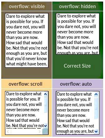 The screen capture to the right (above if you're on a small screen) shows four divisions with a width and height set to 120 pixels and too much content to fit within the division.
Each division, which is just the part shown with black text on a white background, has a different overflow value to show you visually what each value does. For comparison purposes, the division in the green cell shows the division in the correct size.
As you can see in division with the overflow set to visible, the division containing the content has expanded vertically to accommodate the content. In some browsers, rather than the division expanding, the text will bleed outside the division box beyond the box’s boundary.
The division with the overflow set to hidden shows the division container in the correct size, but with the overflow set to hidden some of the text has been clipped off and cannot be accessed unless one were to view the source code of the document.
The division with the overflow set to scroll shows the division container at the correct size too, but part of the space is taken up with the horizontal and vertical scroll bars. With the overflow set to scroll, both the horizontal and vertical scroll bars are added whether they are needed or not.
The division with the overflow set to auto also shows the division at the correct size, but with the overflow set to auto, only the vertical scrollbar was added. There is no content wider than the division container so the horizontal scrollbar was not needed. This is usually the best option.
Adding the overflow property to an element is easy. An inline example:
overflow: auto;">content</div>
You’ll notice I also set the width and height in these examples. If I didn’t, by default a division expands vertically to accommodate the content so the overflow property wouldn’t have been used. The code on the second line is what adds the overflow property.
The following code shows an example of creating a class for a paragraph that sets the overflow property in an external or embedded style sheet:
height: 100px;
overflow: auto;}
In that example I’ve imagined using customer testimonials throughout a sales page. I don’t want the testimonials taking up too much space, so I limited the size of the testimonial paragraphs to 200 x 100 and set the overflow to auto.
Short testimonials will fit into the paragraph without causing scrollbars to appear. Longer testimonials will generate a scrollbar automatically if the content exceeds the space.
In using the auto value for the overflow property, since there is only text in the testimonials, it means only the vertical scroll bar will be generated if needed because the text will wrap to the next line, making a horizontal scrollbar unnecessary.
Note that the scroll bars appear inside the paragraph boxes rather than outside of it. This reduces the horizontal space where the text appears. This should be factored into your decision making process when working with narrow columns of text.
If the space for text is too constricted it can make the text passage read more like a list than sentences. The fix is to increase the width of the containing element and/or reduce the font size.
 The image to the right shows how some browsers will display content that doesn’t fit in the element if you don’t set the overflow property. Notice how the text keeps going as if the constraining element has no bottom.
There are also overflow-x and overflow-y properties. Overflow-x tells the browser what to do when the content exceeds the element’s width. Overflow-y tells the browser what to do when the content exceeds the element’s height. Overflowing toilets are just messy.