Nothing is for sale here. Freewill tips keep the site running. Want to help? → Tip via Paypal
Scalable Background Images
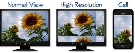
A growing trend in website design is to use a background photo that fills the entire screen without tiling. To do it right, you need to use the CSS 3 background-size property.Done right, the background image will be resized to fit the viewing device. If coded as a normal background it could tile on high-resolution systems, or only a portion of the background will be displayed on small devices (as shown in the image below).
 For your inspection, I’ve created this sample page with a full-page background. That link will open in a new window or tab, depending how your browser is set up.
Open the link and try resizing your browser and you’ll see the background photo resize automatically. Try to resize the browser somewhat proportionately. The browser won’t distort or skew the background image, so if you only resize it in one direction part of the image will be cut off.
Here's the code:
HOW TO CODE PRISM BOX - H3 HEADING
body
  {background-image: url("images/your-bg.jpg");
   background-position: center center;
   background-repeat: no-repeat;
   background-attachment: fixed;
   background-size: cover;
   background-color: #EDEBCD;}
- Line 1 establishes the body as the element being styled.
- Line 2 sets the location of the background image.
- Line 3 centers the background image vertically and horizontally. You may wonder why this is needed if the background is to fill the screen. It establishes the scaling axis at the center of the viewport.
- Line 4 prevents the background from tiling.
- Line 5 prevents the background from scrolling with the page.
- Line 6 enables the background image to be resized to the available space.
- Line 7 sets the background color that will be seen while the background image is loading. Since an image large enough to fill the screen often has a large file size, setting the background color can be important for those with slow connections.
That's all there is to having a background that scales with the viewport, however, even that can be simplified. Using CSS "shorthand" style. All those lines of code can be condensed into this declaration:
{background: #534829 url(images/your-bg.jpg) center center/cover no-repeat fixed;}
That does the same thing as all the other lines combined. In fact, it is all the other lines combined.
Note that it is necessary to use a slash to separate the background position (center center) from the background size value (cover).
Lastly, bear in mind that if the image you choose is too small to fill the screen, the browser will stretch the image so that it will. If it has to stretch the image too much, the image will lose quality. For that reason you want to use a background with somewhat generous dimensions. The exception is if you use an intentionally blurry photo or a photo with only soft lines.