Nothing is for sale here. Freewill tips keep the site running. Want to help? → Tip via Paypal
CSS Styled Scrollbars
Sample Text
Drag the scrollbar on this division to watch the color change.
If we create happiness for others, happiness will always be our companion.
Dare to be magnificent! Even if you come up short, you'll surely be better than if you didn't try.
If you want to leave your mark on the world, make sure what you do benefits others, otherwise your mark will likely be little more than dusty, old grafitti in the end.
Now, years later, colored scroll bars are back in style for on-page elements like the division to the right. And , there are better options than ever. The options are better than ever, but they're only for on-page elements, they can't be used to change the browser's scrollbar like you could with IE.
With this version of colored scroll bars you can set several parameters:
- Set the width for vertical scroll bars
- Set the height for horizontal scroll bars
- Set the track:
- color
- hover color
- border color
- border width
- border radius
- border style
- active color
- Set the thumb:
- color
- hover color
- border color
- border width
- border radius
- border style
- active color
You can use a background image instead of color. Gradient colors work, too, as you saw if you activated the scrollbar in the example.
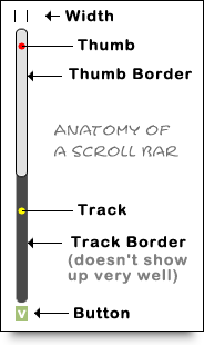 Before I show you the code, let’s take a look at the anatomy of a scroll bar so you know which parts are being discussed.
The graphic should be fairly self-explanatory, but let me point out two quick things:
- The track border in my example doesn’t show up very well because of the colors I chose...but I liked the look! ;p
- The button isn’t on the actual scroll bar example used above. I added it to the graphic so you’d know where it would be if used. There would also one at the top but instead I placed the markers to show the width where it would be.
Now that you’ve had a chance to study the anatomy of a scroll bar, let’s take a look at the scroll bar code. To make the code easier to read I’ve included blank lines in between chunks of code, but you may safely omit any empty lines. Here’s the code…
.scroll::-webkit-scrollbar {width: 10px; height: 10px;}
.scroll::-webkit-scrollbar-button {width: 0px; height: 0px;}
.scroll::-webkit-scrollbar-thumb {background: #e1e1e1; border: 1px solid #000000; border-radius: 50px;}
.scroll::-webkit-scrollbar-thumb:hover {background-image: linear-gradient(purple, orange)}
.scroll::-webkit-scrollbar-thumb:active {background: #00ff00;}
.scroll::-webkit-scrollbar-track {background: #494949; border: 1px solid black; border-radius: 50px;}
.scroll::-webkit-scrollbar-track:hover {background: #494949;}
.scroll::-webkit-scrollbar-track:active {background: #000;}
.scroll::-webkit-scrollbar-corner {background: transparent;}
- Line 1
- Set the width for vertical scroll bars and the height for horizontal scroll bars.
- Line 2
-
Sets the button properties, not used in the example. The size is set to zero so they take up no space. If you desire the up and down arrows, images are usually used for that. You'd set the size to the size of your up and down arrow images, and include the following property and value:
background-image: url(images/scrollbar-button.jpg);
Be sure to change the image name to your image’s actual name and correct the path to the image if need be. The arrows look odd with rounded thumbs. To make it work you could remove the radius from the thumb, or make images that fit with the look of rounded thumbs. Arrows with a transparent background would probably work best, but you could experiment with other looks as well.
- Line 3
-
Sets the thumb properties. The "thumb" is the thing you grab with your cursor if you want to scroll. The background property is the color of the thumb. The border places a border around the thumb. The border radius allows you to round off the corners of the thumb. For the border, you can use any of the standard CSS border styles:
solid | dashed | dotted | double | outset | inset | groove | ridge
- Line 4
- Changes the color of the thumb when someone hovers their cursor on it.
- Line 5
- Changes the color of the thumb when someone clicks and holds it to drag the thumb to scroll the element.
- Line 6
- Sets the track color, track border, and corner radius. As with the thumb border, you can use any of the standard CSS border styles.
- Line 7
- Lets you change the track color when a user hovers their cursor on it or on the thumb.
- Line 8
- Lets you change the track color when someone drags the thumb to scroll.
- Line 9
- Lets you set the color (transparent in this example) of the small area where vertical and horizontal scroll bars meet.
That all there is to it. I know a big chunk of code like that may look intimidating if you’re new to CSS, but if you just take it one little chunk at a time it’s really not that complicated. You can do it!
How to Use the Code
The way I set the code example up is for an external style sheet. Each chunk of code is written with a class name of scroll. To use the code in a division element like I did at the top of this page just include the class name with the element, like so:style="width: 200px;
height: 300px;
overflow: auto;">
...content here...
</div>
You will usually have to set the height of a division for the scroll bar to appear. I did so with an inline style. You’ll also need to use the overflow property, which tells the browser what to do with the excess content in the division (in this case, to create the scroll bar so the division can be scrolled).
If you want all your scroll bars to have the same look you create, you can remove the .scroll part in front of each double colon (::) in the code. That way any page that links to your external style sheet will have the scroll bar you design in modern browsers or WebKit-aware older browsers.
The may also find the following tutorials helpful: